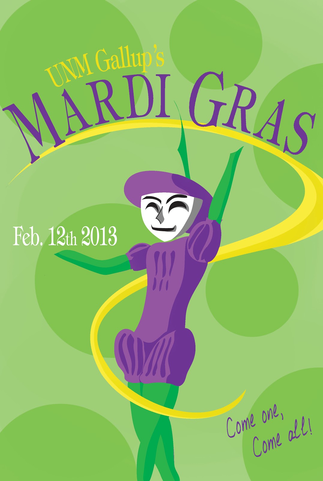
Here's a mid process MG poster.
The original illustration was black, white, grey and red. It was very theater-ish and not very Mardi Gras.
Thanks Mitch! This is one of Mitch's illustrations of a jester.
I'm still working on using the other two jesters for a variation of the poster.
Quick question: Answer honestly! Is the back ground too much with the dots?
Here's a redesign of the original file I was doing. It has the lobo colors (I think.)


NICE!!! I really like the top piece & no the dots isn't too much. ^_^ It actually adds to the piece & makes it really interesting.
ReplyDeleteAnd I really like the bottom one with the UNM colors. Although... I admit I'm getting more of a theater vibe than Mardi Gras with that one.
Other than that, great job will all your pieces!
I agree on the Lobo theater vibes >.< But doesn't the jester just look so awesome in its natural reds?! Guess its still a work in process... on the poster that is. Maybe I should try rearranging the colors?
DeleteMaybe? But I'm really liking the funky one on top. Great job! ^_^
Deleteim diggin the lobo poster more(: for both posters the colors stands out evenly, however i think the colors for the jester (lobo) shouldnt be all red? i could be wrong but it could be mix wit another color?..
ReplyDeletenice job though!(: